
With the craziness of the holidays, I took a few weeks off from "New Color Monday", but I'm excited to share the latest in my adventures with color. Today I'm focusing on a couple of Michael Harding colors that are new to me, Cobalt Violet Light (series 6) and Brilliant Pink (series 2). Last week to my great delight, I found my favorite flower at Sprouts, so I paused work on other paintings to do a small 9x6 study of these beautiful pink peonies.
Whenever I post a peony painting, I get bombarded with questions about which colors I use to achieve those vibrant pinks. Normally my go-to palette includes quinacridone magenta, alizarin crimson permanent, and Vasari ruby red, which are all quite strong and transparent. This time I decided to try out Cobalt Violet Light and Brilliant Pink instead, and I was very happy with the results.
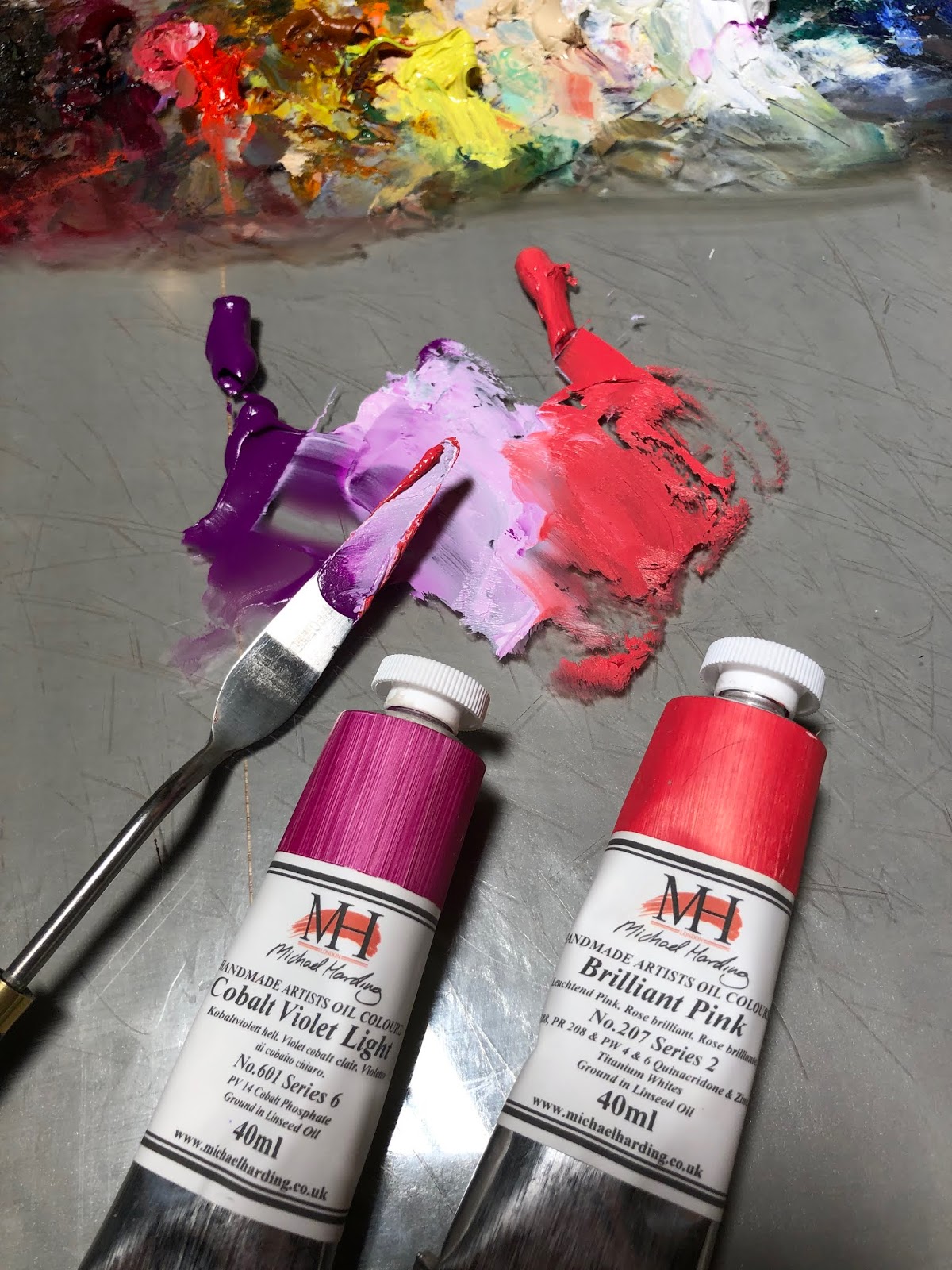
First of all... let me say that red is one of those colors that loses its intensity as soon as you mix it with anything else. If you want it to stay pure and vibrant, it's best to use it straight out of the tube. That's why, in my opinion, you can't have too many reds (or pinks/violets) in your arsenal of paints. If you do decide to mix it with something, try it out on your palette before you go nuts with it on the canvas. And if you want it to look especially pure and untainted, thinly apply an under painting of pure color (straight from the tube) in the areas where you want it to appear most vibrant. That's what I did in this painting. Once I applied the paint in what I knew would be the "pinkest" areas, I made sure to leave it alone; the white of the canvas showing through made it especially vibrant. I mixed a lot of white into the lighter areas and carefully built up the paint volume around the translucent spots.
I found that the two Michael Harding colors looked lovely when mixed together, as well as when mixed with white. Neither was overpowering or infectious in its tinting strength; instead I could gradually build the color without worrying that it would be too much (Old Holland's Brilliant Pink, for example, has a much higher tinting strength than the MH). The colors lend themselves nicely to the delicate nature of peony pedals; both are semi-transparent, which makes them strong enough on their own, but especially lovely when mixed with white. The Cobalt Violet Light is expensive... but absolutely beautiful. When mixed with white, it somehow maintains its warmth and provided the exact "purplish-pink" I was seeing in the light sections of the flower pedals. The Brilliant Pink definitely has more coral/orange in it, making the Violet appear cooler and thus creating some beautiful complementary temperatures.

I completed some of the darker sections of the flowers with the help of transparent oxide red, permanent mauve, ivory black, and alizarin crimson permanent, but for the most part the two MH color remained the stars of the show. Below is a shot of my palette towards the end of the painting.

Below: the finished painting. I hope you are enjoying these posts. I always love hearing your thoughts!

"Pink Peonies," 9x6", oil on linen panel (available - annarosebain@gmail.com)


Absolutely stunning! Thanks for the information! Hopefully you will offer floral lessons in the near future :)
ReplyDeleteThanks for the information.
ReplyDelete